Control Overview
The Screen Size control allows you to conditionally show or hide blocks based on the width of the current screen. This control can be useful to assist with “responsive design”, where some content is hidden or displayed based on the current user’s screen size. Think mobile or tablet users versus desktop users.
It’s important to note that the Screen Size control is the only control that hides blocks using CSS. All other controls conditionally render content at the server level. This means that content hidden by the Screen Size control is still loaded on the page/post. It’s just hidden with display:none CSS. Consider the Browser & Device control if you are looking to conditionally render blocks based on devices.
Usage Examples
- Hide content on mobile devices that would clutter the page.
- Display content that is specific to mobile devices, such as App download links that would not be compatible with desktop devices.
Configuration
How to Enable
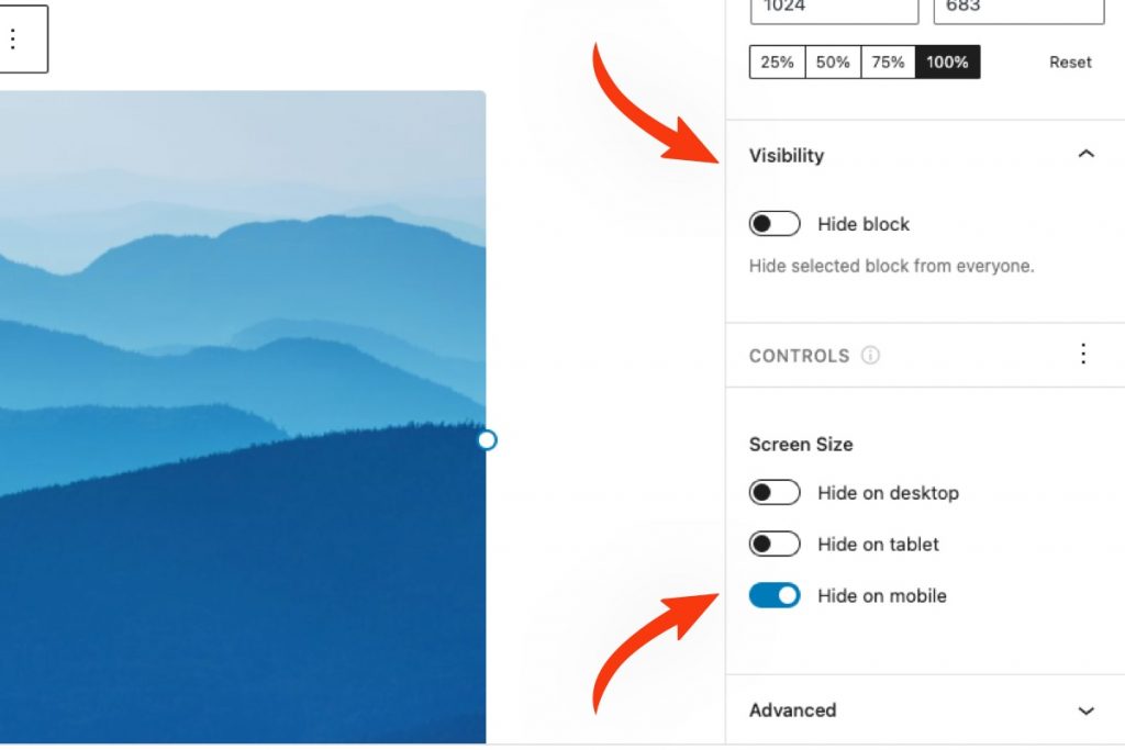
Click on any block in the Block Editor and navigate to the Visibility panel in the Settings Sidebar. You will notice the Screen Size control located beneath the User Role control. See the screenshot below. This control is enabled by default for all blocks. You can choose which controls are automatically enabled in the plugin’s General Settings.

How to Configure
Instructions are always better with examples. Let’s assume that we have a header image on our page that we only want to be visible on Tablets and Desktops. On Mobile, we just want to present the user with the written content on the page.
Steps to Complete
- Navigate to the Screen Size control settings in the Visibility panel.
- Toggle on the “Hide on mobile” option.
The resulting configuration should resemble the screenshot below.
Advanced Configuration
By default, the Screen Size control includes three options, “Hide on desktop”, “Hide on tablet” and “Hide on mobile”. Each screen size has a preset “breakpoint”. A breakpoint is a point at which the screen turns from a “mobile-sized screen” to a “tablet-sized screen”, etc. The default settings are highlighted in the screenshot below.
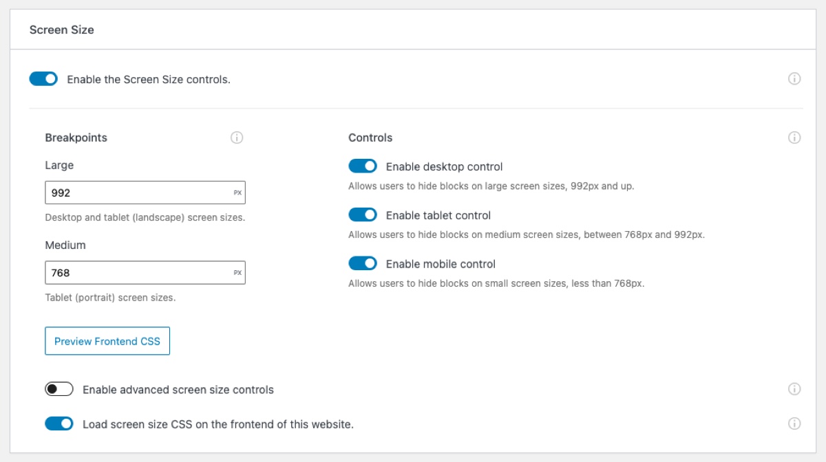
All presets can be controlled from the Screen Size control panel in the plugin’s Visibility Control Settings, which is what you see above. This allows you to alter the default breakpoint values to better match your current theme if needed. You can also enable or disable certain screen size options that you may not want to allow your Editors/Authors to use.
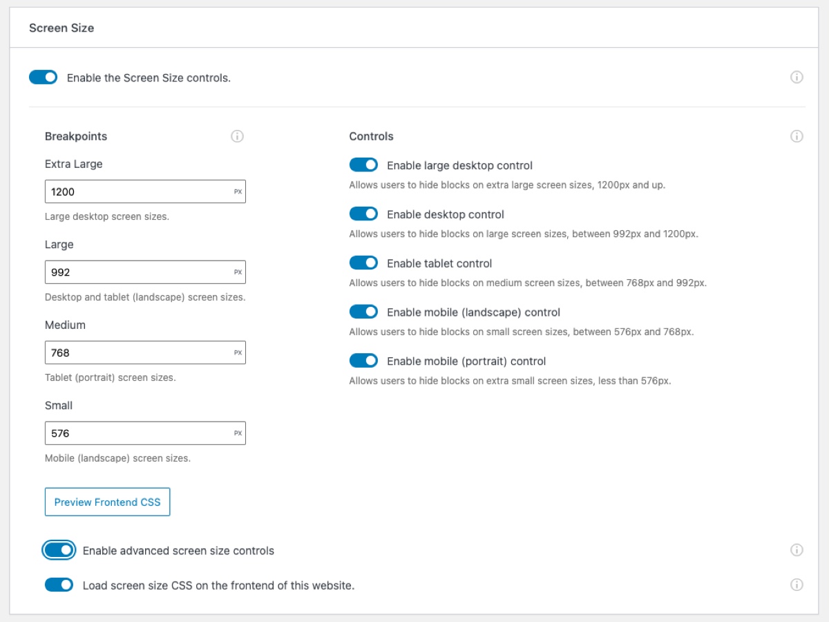
For even more advanced usage, you can enable two additional screen sizes and breakpoints. See the screenshot below.
How to Disable
If you would like to disable the Screen Size control at the block level, simply click on the vertical ellipsis icon in the “Controls” bar and deselect it. That said, if you don’t think you will need this control on your website at all, it can be disabled globally in the Visibility Control Settings.
Note that if this control is disabled globally, any blocks that are actively being hidden by the Screen Size control will become visible again.
Limitations
This visibility control adds CSS classes to each block when enabled. It uses these classes to show or hide blocks. Unfortunately, not all blocks support CSS classes, notably the Shortcode and HTML blocks.
If you run into a block that is not working with the Screen Size control, there is a quick and easy workaround that can be applied in most use cases. Simply wrap the block in a Group block. Then apply the screen size settings to the Group block, and everything will work as expected.
For more information and a live walkthrough, check out the video below.