In this tutorial, we will show you how to conditionally display any WordPress block based on the width of the screen (browser window) using the Block Visibility plugin. This functionality allows you to effortlessly show/hide blocks on desktops, tablets, or mobile devices.
Please note that this tutorial applies to the Block Editor, also known as Gutenberg. Block Visibility was designed exclusively for blocks and does not work in the Classic Editor.
Why Display Blocks Based on Screen Size?
The Block Editor, coupled with the Block Visibility plugin, makes creating dynamic content incredibly easy and requires zero coding skills. Best of all, it’s free!
Here are a few examples of why you might find the Screen Size control useful.
- Hide content on mobile devices that would otherwise clutter the page.
- Display content that is specific to mobile devices, such as App download links or “Click to Call” buttons, that would not be compatible with desktop devices.
- Improve responsive design functionality in the Block Editor. Often you will find yourself needing to show/hide various blocks depending on screen size, notably Spacer blocks. Responsive settings are still in preliminary development for WordPress and will likely not be included in core until 2022.
Now that we have addressed the “why”, let’s show you how easy it is to create conditional blocks based on screen size.
How to Conditionally Display Blocks
For this tutorial, we have a demo website that sells “Outdoor Adventures”. The homepage of the website looks a bit cluttered when viewed on mobile devices. Therefore, we want to conditionally hide a few blocks to improve the user experience and increase conversions.
Watch the quick video tutorial below, or if you prefer written instructions, continue reading.
Video Overview
Step 1: Identify the Blocks That Need to be Hidden on Mobile
On the homepage of our “Outdoor Adventure” website, we have a section entitled “Explore The World”. While this section looks great on Desktops and Tablet, it’s not needed on mobile and distracts from the primary call to actions.
This section is made up of two Spacer blocks and a Cover block. See the screenshot below.

Step 2: Apply Screen Size Visibility Controls
Now that we have identified the blocks that need to be dynamic, we can proceed with applying visibility conditions to each blocks. We will be using the Screen Size control, which is available for free in the core Block Visibility plugin.
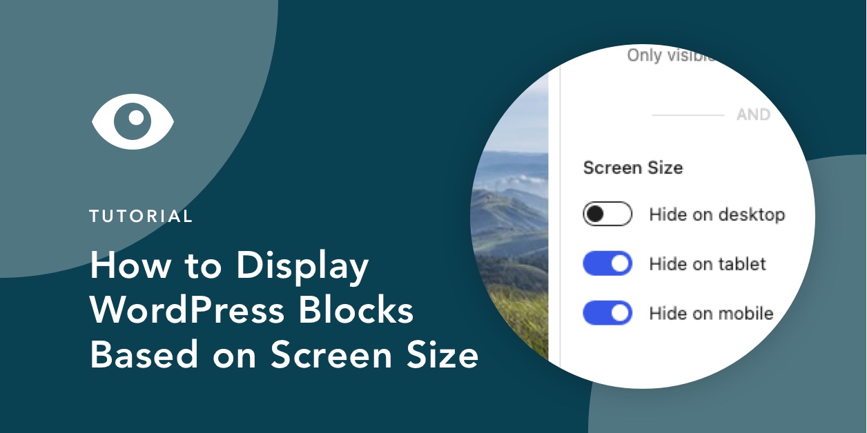
Start by selecting the first Spacer block. Navigate to the Visibility panel in the Settings Sidebar. Ensure that the Screen Size control is enabled. Then simply enable “Hide on mobile”.

Repeat this step for the Cover block and the second Spacer block. Update the page and those blocks will now be hidden on all mobile devices!

Step 3: Modify Plugin Settings to Match Theme (Optional)
By default, Block Visibility provides default CSS breakpoints that power the Screen Size control. Breakpoints specify in pixels the minimum screen size for tablet devices and the minimum size for desktops. While the defaults will likely work for most users, you can modify these breakpoints in the Plugin Settings to better match your current theme.
A detailed overview of the Screen Size control settings is available in the Knowledge Base, but here is a screenshot of the available options. The video tutorial above also walks through the available functionality.

We hope this article has shown you just how easy it is to show/hide any WordPress block based on screen size using the Block Visibility plugin. If you haven’t already, download the plugin for free on WordPress.org.
If you want to stay updated on all future tutorials and plugin news, please consider subscribing to our YouTube Channel or following us on Twitter.
Until next time…


Share Your Thoughts